About Me

My photo
I am a multifaceted woman, living with intention and passion. I always see the glass as half full (ok, almost always). Currently into: jewelry design, glass beadmaking (aka lampworking), visual journaling, cooking and web design everything. Things that bring me great joy: my family, friends, Scrabble, British period pieces, Shabby Chic, Austin, TX, mini art tiles, autographed cookbooks, chocolate, Chianti, pedicures and beach glass. I don't "do" and/or dig: dishonesty, guilt, intolerance, unkindness, drama and goat cheese (it's a long story, but I love all the other cheeses!) So you now have a teeny tiny little picture of me, with a few warts thrown in. Welcome to my world!
Showing posts with label 2D Design. Show all posts

Tuesday, January 18, 2011

College Day 2!

Typography

     I had my first Typography I class this morning, bright and early at 8 a.m. If you know me at all, you know this was very difficult for me, since I am not a morning person, I'm barely an afternoon person for that matter. But I am trying to retrain my brain and hopefully one day, I will be an early bird. I have read about body clocks and about being born wired a certain way, but I refuse to accept it. I am so much more productive on those days when I am up early, for whatever reason, and I love that feeling of accomplishment, especially when it isn't even noon and I've already completed several projects or chores. But I digress. 
     I LOVE this class! The instructor is very passionate about type, it's history and all the design possibilities connected to type, both print and digital. I thought this class would be all book learning, but we will be working on projects and presentations throughout the semester, I am sooo geeked! As a passionate wannabe web designer/developer, I think understanding type is so important. It can relay information AND design at the same time, how cool is that? But, for those who don't already know, what makes type more readable in print does not pertain to screens. Serif fonts, like "Times" and "Georgia," are great for print media. However, sans serif fonts, like "Verdana" and "Arial" are much more readable on a screen. Conversely, when you are creating a bold headline it is the opposite for both. How bizarre is that? And, the leading, which is the space between the letters of a word, has to be increased for screen print. And there's more, so much more, but I am just learning myself and don't want to get carried away here when I still have so much to learn. But I think it is easy to see why a good understanding of type and fonts is crucial to the creation of any good web design that incorporates any kind of type.
     I feel so lucky to be on this road to web design. My husband has been so supportive along with my parents and my friends. Sometimes I feel like I could just burst apart at the seams, I am so full of joyfulness and thanks. Oh, it is so good to be alive!


This is our textbook for the class, but anyone interested in typography would enjoy this and should have it as a reference tool. 

Saturday, January 15, 2011

Under the (Winter) Weather and 2D Design Portfolio part IV

Winter from my front window.
     I took this winter photo a few weeks ago. We had a winter storm and it left our streets completely buried, no sign of the road at all! We were snuggled up inside with our fireplace on "high," eating comfort foods and watching movies. I love cocooning every so often, but once we are halfway through January, I'm ready to start getting out more and staying in less. But here in northern Michigan, that is really not an option, lol, the weather is what it is. But it sure does bring my family closer together.
     Speaking of the weather, I am under it today. Started with a scratchy sore throat  and is evolving into a scratchy throat with cough, sheesh. I really don't have time for this. I'm whining to be sure. My last weekend before school starts and "bam!" Of course, being under the weather also means I have to alter my plans to clean and organize my room. Instead, I can pull out my visual journal supplies and create! So maybe I'm supposed to be making more time for creating instead of cleaning, right? At least that is what I am choosing to get out of this whole being sick situation.

Analogous color collage

     Back to my 2D Design portfolio. This is another color collage exercise, this time using analogous colors from the color wheel. Red, red violet and violet. Once it was finished though, all I could think of was the Red Hat Society, not at all what I was going for, to say the least. Nothing against the RHS, but those colors have become so iconic, one they are together, that is all I can think about. A good lesson though. Again, I used my visual journal supplies and techniques to create this piece. It is actually 3 dimensional, with some raised birthday candle letters. There was a purple plastic frog on it too (yeah, I know, kooky), but it fell off, obviously something that really didn't belong. I am really going to miss not having this type of class this semester. So nice to break up the textbook learning and computer programs with hands on art. Maybe next fall I'll have another art class.

2D Design Portfolio, part III

Split Complimentary Color Collage
     When we moved into the color portion of 2D Design, I had a blast with the collages we had to create. This is the first one, which is an exercise using split complimentary colors, textures and movement. My good camera would not pick up the correct "blue green" color, so I had to adjust it in Photoshop to show the most accurate color. I'm still not happy, so I obviously have more to learn with Photoshop, since you can do everything with that program! We were allowed to use any mediums in any combination to create these collages, so I used my visual journal supplies.This was my instructor's favorite piece and probably mine as well. I hope to adjust the color and repost this at a later date. I'll post another piece or two tomorrow from the color portfolio.
     And we have winter back in full force here, lots of snow falling and more on the way all week. It is beautiful, but honestly, I've had enough already. Wonder if Calgon still takes you away?

Thursday, January 13, 2011

2D Design Portfolio, part II

Figure ground exercise
     This was one of my favorite exercises, I loved playing with the figure ground concept. Creating an image that can be seen one of two ways, depending on whether you focus on the black or white components. Of course, that is not the technical definition, lol, but that is how I interpreted it. We spent several weeks on figure ground exercises, so I think my instructor likes them too. Within the next day or two, I will post some of the color pieces. Again, I just loved this class and learned so much!
This first image is my first "text" figure ground image. I was focusing on web design and just played around with lettering until I was happy. I hope to use this piece on my website someday, maybe as part of my online portfolio.
Figure Ground Personal Image
This second image is also an exercise in figure ground, but we had to create a personal image. I wanted something that represented web design and could be used on a business card or as a logo on my website. After numerous attempts using a "web," computer screen, spider and text, I finally came up with this one, which I am still very happy with and intend to use in the future as well.
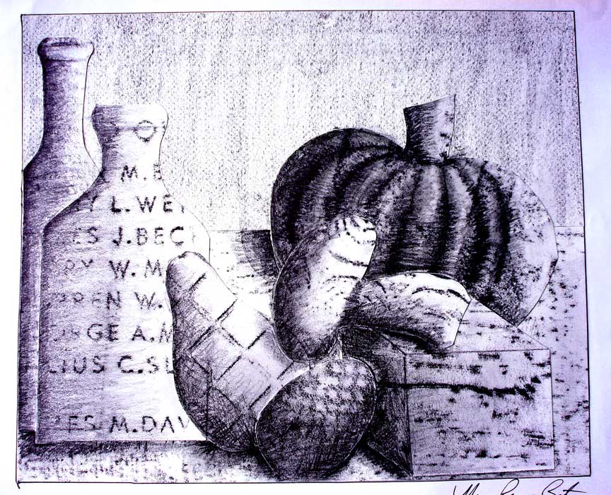
     This final black and white piece was an exercise using texture. We had to go around the class room, building, inside and out, and create rubbings with graphite sticks. After we had collected a variety of rubbings, we had to create a still life by cutting them out in several assigned shapes and within a measured format. I am not good at drawing, so this was so much fun for me, more of a montage with the layering of texture and shapes. After we had the shapes rubber cemented down, we had to shade and highlight the whole thing. In case you can't tell, my still life is composed of two bottles, a pumpkin, a pear, an egg, a square block and a mushroom. I would love to do this again someday, collect some great rubbings from around town and then create a still life that represents this area. We'll see, I always want to do everything, but of course, there are not enough hours and days in my lifetime to do everything, sigh.
Texture Rubbing Still Life

Wednesday, January 12, 2011

2D Design Portfolio, part I

Irregular width straight lines

     Part of my 2D Design class last semester involved creating a portfolio with all our assignments. I will add a few of the pieces with each blog post for the next several days, since I don't want to overload anyone. The class was taught using the "Bauhaus" method, which apparently is a old and well respected way to teach 2D Design. We started with simple dots, then straight lines of the same width and kept expanding from there. I am not going to show the very early pieces, they are nothing special. But some of my later pieces I really enjoyed and received good feedback from my instructor. I learned so much in this class, I would recommend a "Bauhaus" method 2D Design class to anyone interested in design, no matter the medium. I absolutely loved this class and was very fortunate to have an excellent instructor.
Irregular curved lines and straignt lines

I struggled to learn to use the exacto knife properly in the beginning, but eventually got the hang of it, only cutting myself once, and just a little nick. I am not a photographer and I struggled to take good photos of my work, but some of the images came out "crooked," even though the actual pieces are very straight with even borders. We were graded on craftsmanship, so I did work very hard to make sure everything was straight, even and clean. I have always been a "messy" artist, so the effort it took to create "clean" work was nothing short of super human for me, lol, but I have to admit, I learned how to create clean work and how to use a metal ruler to my advantage. I'd never spent a lot of time with a ruler until I took this class, what a revelation! So now I love my metal ruler and exacto knife and plan to use them whenever I need to create straight lines and cuts, beats a pair of scissors any day!
5 assigned shapes, overlapping allowed, seen as a cutout
     Tomorrow I have three more black and white images from my portfolio to share and then I'll move onto some of the color images I created. I am only selecting the most interesting pieces, and again, I am a beginner, beginner, beginner! I can make glass beads, jewelry, visual journal pages and I can cook. However, before I took this class, I could not draw a straight line or create any images with paper, ruler and exacto knife, not to save my life. Seriously. Ask my mom.